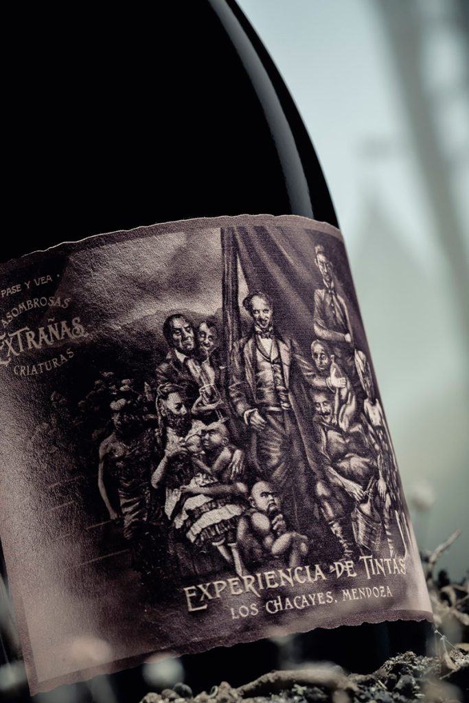
A quick glance at the supermarket aisles will tell you that over the past few years, Argentine wine labels have gone through a revolution. The phenomenon of Argentine wine label design is being driven by fresh new approaches to color and illustration full of ingenuity, playfulness and word games that only a short time ago would have been unthinkable on the local scene.
The leaders of the new movement in Argentine wine label design say that the shift dates back to around fifteen years ago, when a new generation of wine professionals started to develop new, more personal styles for their wines.
In many cases, they didn’t have the distinctive iconography of traditional wineries and so found themselves needing creative ways to make their products stand out. And so more “revolutionary” labels began to appear, and even some of large wineries began to join in. It’s what is often described as a new paradigm.
In Mendoza, three design studios share their vision of the current scene and the interest in Argentine talent in overseas markets.
Argentine wine label design: three notable examples
Carolina Saguan: “Wineries understood the concept of storytelling”
Carolina Saguan is a graphic designer, although for eight years she worked as a marketing manager for wineries, which helped her to understand what importers wanted and what they and their customers valued. When she decided to move into design, she opted to plunge head first into wine packaging for Argentine and overseas wineries.
Regarding Argentine wine label design, she says, “The aesthetic for labels changes by region: in Europe, they’re still mostly traditional, while in the USA, Australia, Chile and Argentina they’re more experimental.” She adds that until recently Argentine wine labels often had “a very ‘French chateau’ aesthetic.
“Wineries understood the concept of storytelling, resulting from the need to build an emotional connection with consumers.
“After twelve years creating wine identities for Argentine, Chilean and Spanish brands, I think that the best labels are the ones that stick to a coherent concept. Just designing something pretty is the easiest option.” She also emphasizes the importance of context: “It’s different depending on whether you’re buying a wine for you or you’re going to a dinner and you want to surprise people with a label that gets people talking.”
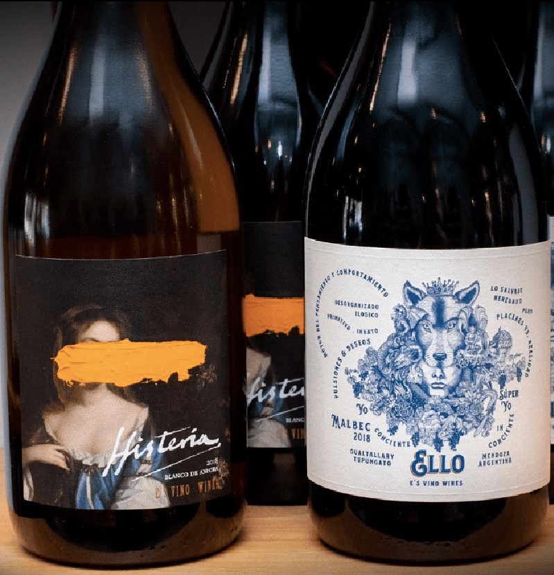
Regarding her working method, she says, “I start with a brief or a questionnaire to help people take decisions that, I admit, sounds a lot like what you might hear from a psychologist. I make a comparative chart with the answers and use the strongest matches as the basis for the label’s design.” Saguan has won several international awards and has designed labels such as “Alma 4”, “Demente”, “Ello”, “Flores blancas” and “Flores negras”.
Oveja & Remi: “A label is a small poster”
“Apart from the labels, we need to acknowledge another important change: the fact that design is no longer an added extra you get from advertising agencies,” says Matías “Remi” Basoalto, a psychologist and partner of the designer Miguel “Oveja” Quiroga at the multi-award winning studio Oveja & Remi, who currently work almost exclusively for overseas clients.

“We grew up seeing spectacular posters and we want to apply the same concept to wine labels.”
Basoalto appreciates wineries willing to take risks. For instance, just before the pandemic they got a commission from Emiliana, a Chilean winery they’d worked with before. The idea was to develop a concept for the UK market that they called “Capo Nativo”, inspired by the TV series “Peaky Blinders” only with characters drawn from the natural world.
“During the pandemic, everyone started watching the series and the wine’s visibility grew across the world,” says Remi.
Nano Alfonsín: “The new oenologists are the game changers”
Mariano “Nano” Alfonsín entered the world of wine packaging when he was just twenty. Today, he’s thirty-six and has his own studio in Mendoza where he works for clients from across the world. In 2021 he won a prize at the Latin American Design Awards in the Wine/Sparkling Wine packaging category with his original concept for Desde los Polos, a Pinot Noir made by Andrés Vignoni and Mariano Braga.
“Independent oenologists are changing the game. While traditional wineries kept their classical designs for years, these professionals didn’t have a hundred year old story to tell and sometimes not even a winery façade to draw,” he points out, saying that Matías Riccitelli’s “Hey Malbec” was a pioneer in that regard.
“Who else would have dared to put a superhero on a label? As we started to add more disruptive designs to our portfolio, several overseas wineries started to get interested in our work.
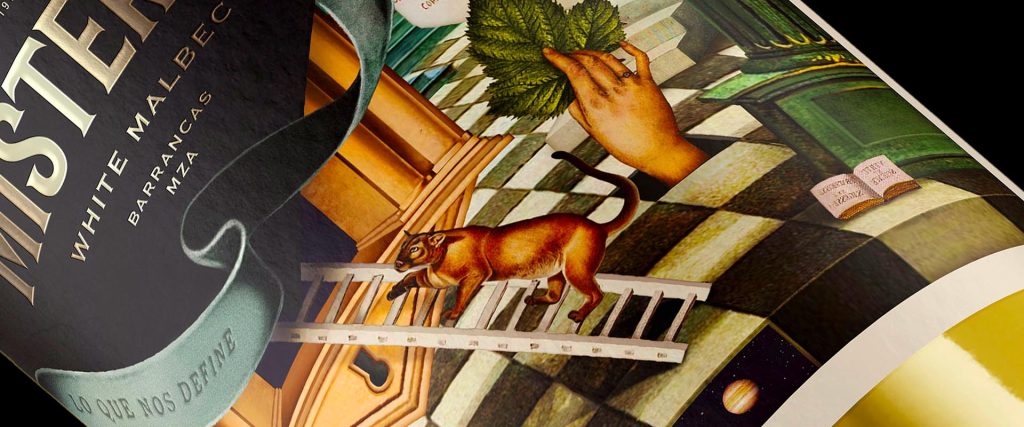
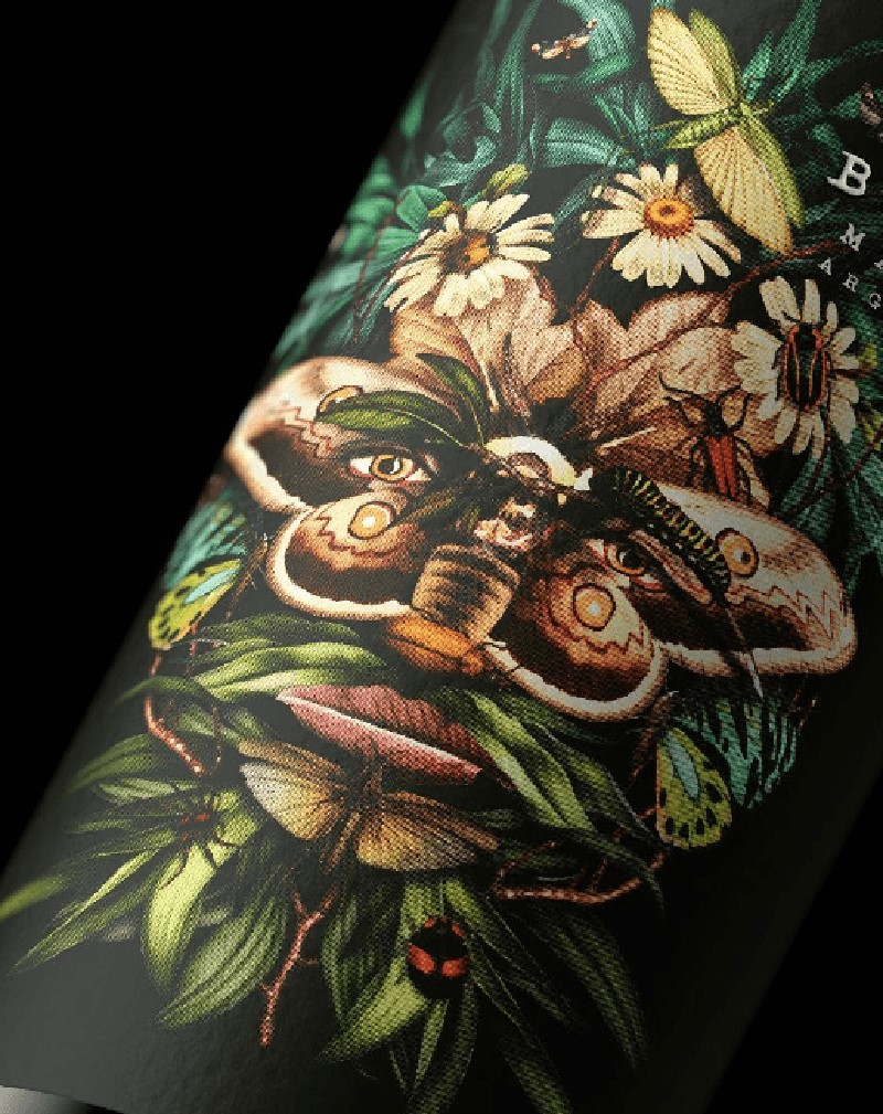
“I don’t know if Argentina has a clear-cut style, in fact there are some lovely classical labels that sit perfectly next to more experimental ones. Illustrations are definitely in vogue, as is making use of the entire label.
“In the end, it’s all about getting the public to choose your bottle in the store and to do that,” he says, echoing his colleagues, “you need to tell a story.”